The Las Vegas Renegades
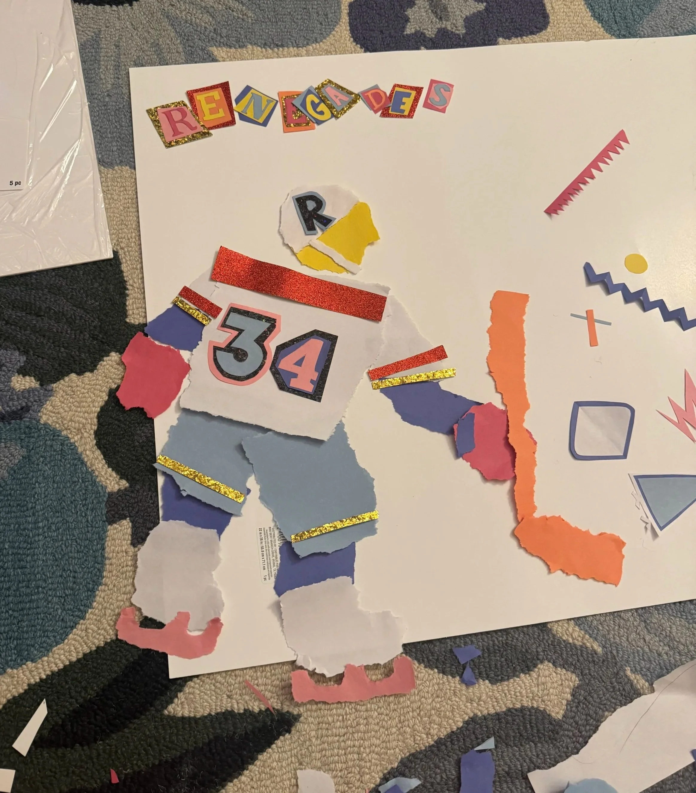
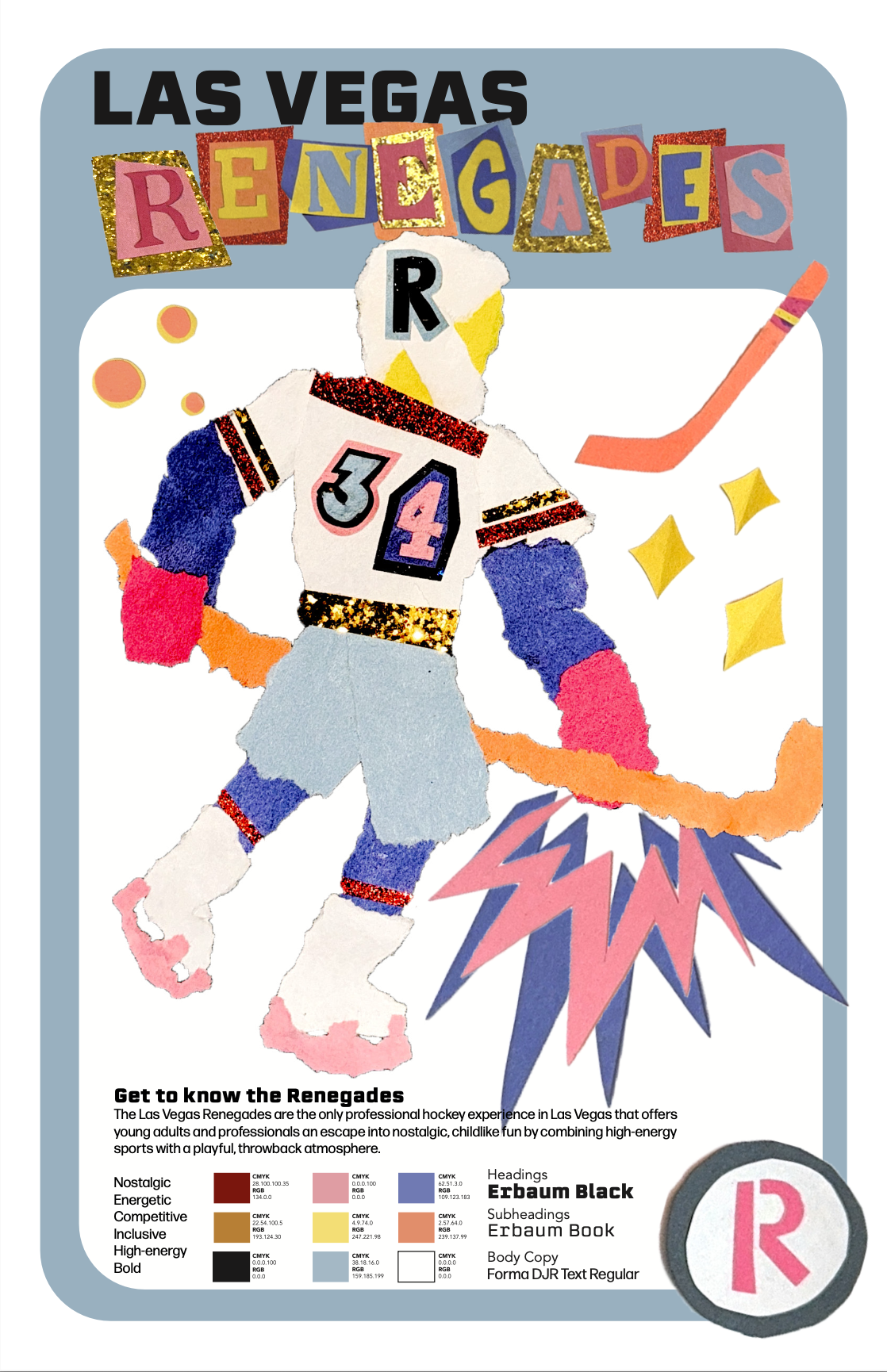
Created with torn paper, the Las Vegas Renegades are a fictional AA hockey team based in Las Vegas.
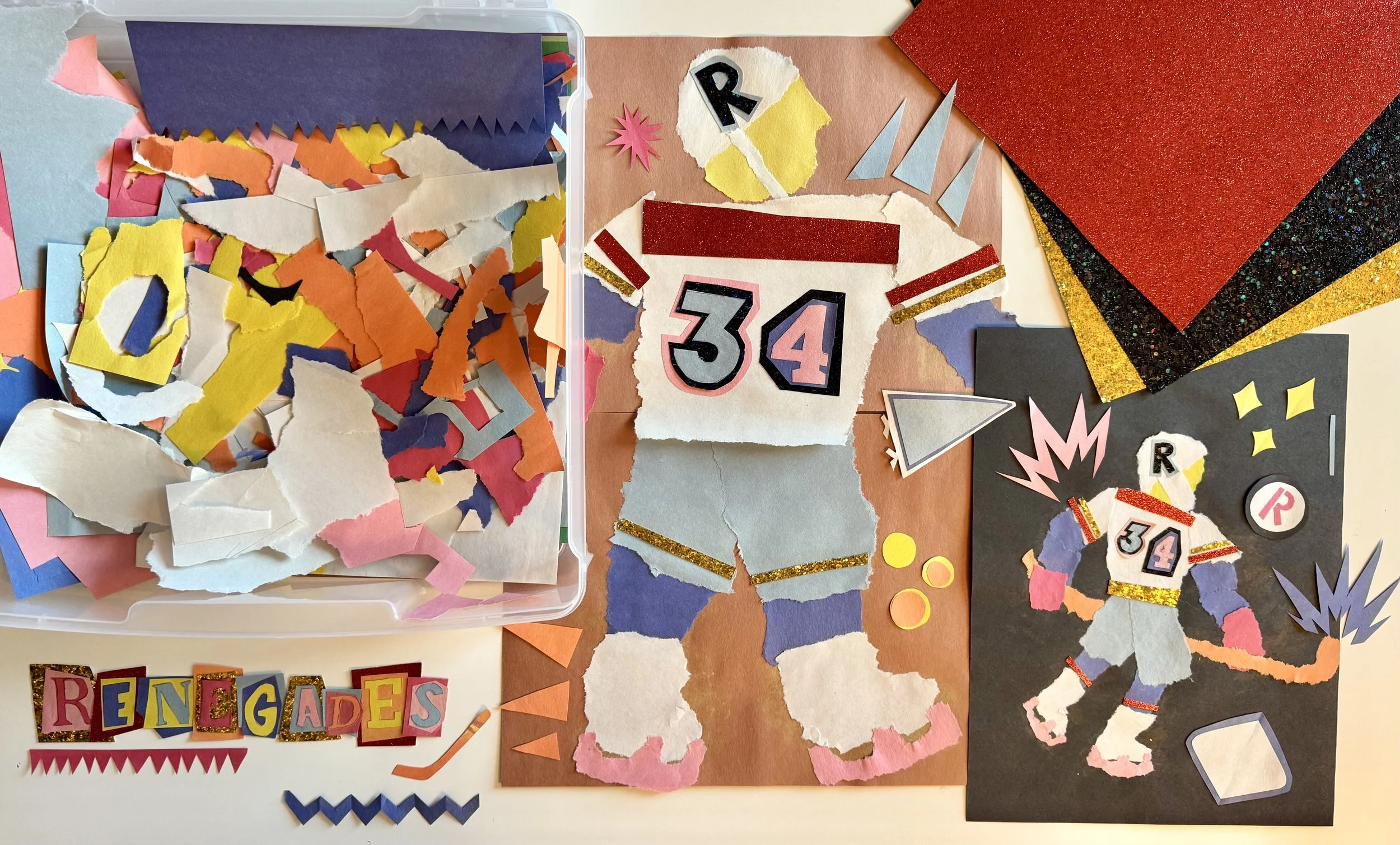
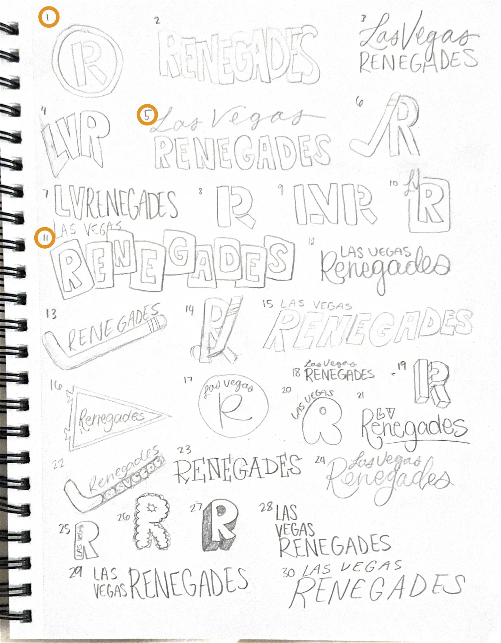
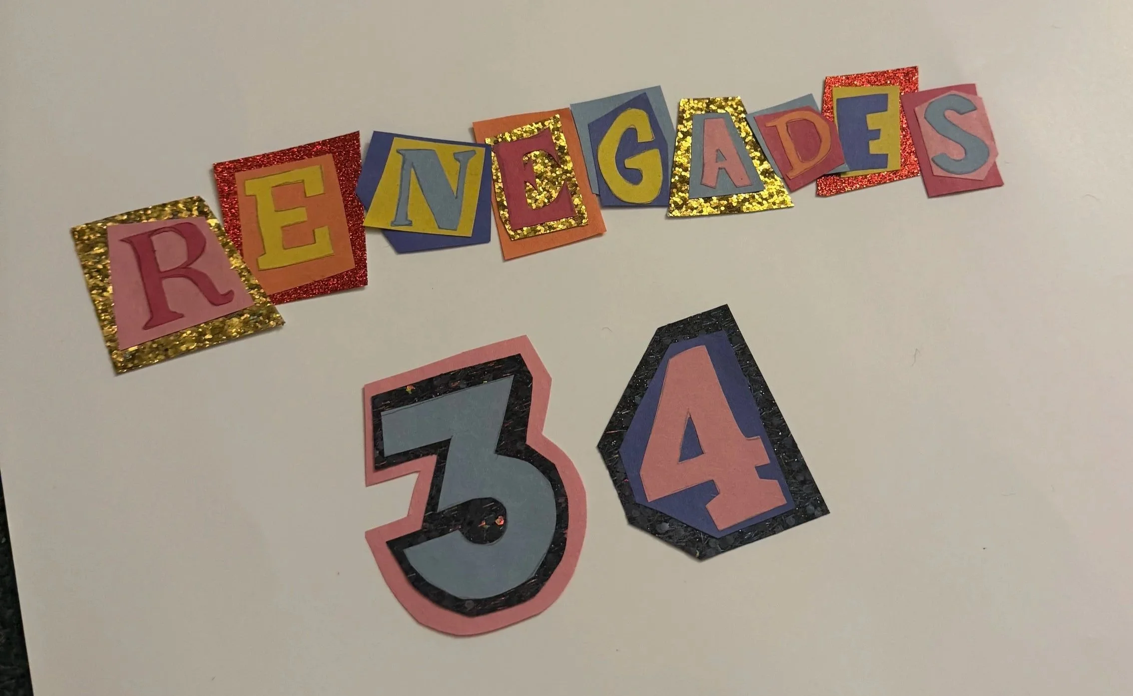
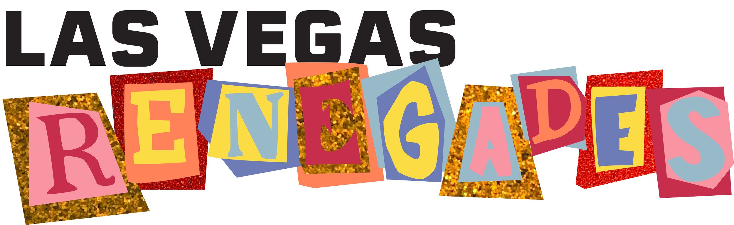
The Las Vegas Renegades brand was developed through a structured, research-driven process that began with identifying the core consumer need for diversion and refining it into a clear Onlyness Statement focused on providing young professionals with an escape from routine. Early ideation explored multiple visual and conceptual directions, including varied color systems, typography, imagery, and logo sketches. These ideas were refined through critique, self-assessment, and research, resulting in a cohesive visual identity defined by bold color, angular motion-driven forms, nostalgic collage textures, and emotionally resonant messaging. The vision board established the brand’s tone and aesthetic foundation, while logo development balanced expressive personality with clarity and scalability. Finally, a comprehensive system of media assets, including billboards, social media, uniforms, and animation, was designed and refined for consistency and real-world application. The final outcome is a unified, research-supported brand identity that effectively communicates energy, nostalgia, and emotional escape within the competitive Las Vegas market.
Brand Development
Brand Elements
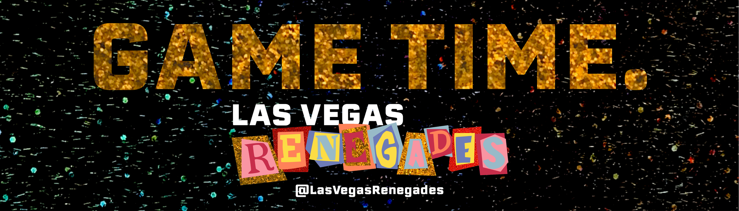
Billboard Designs
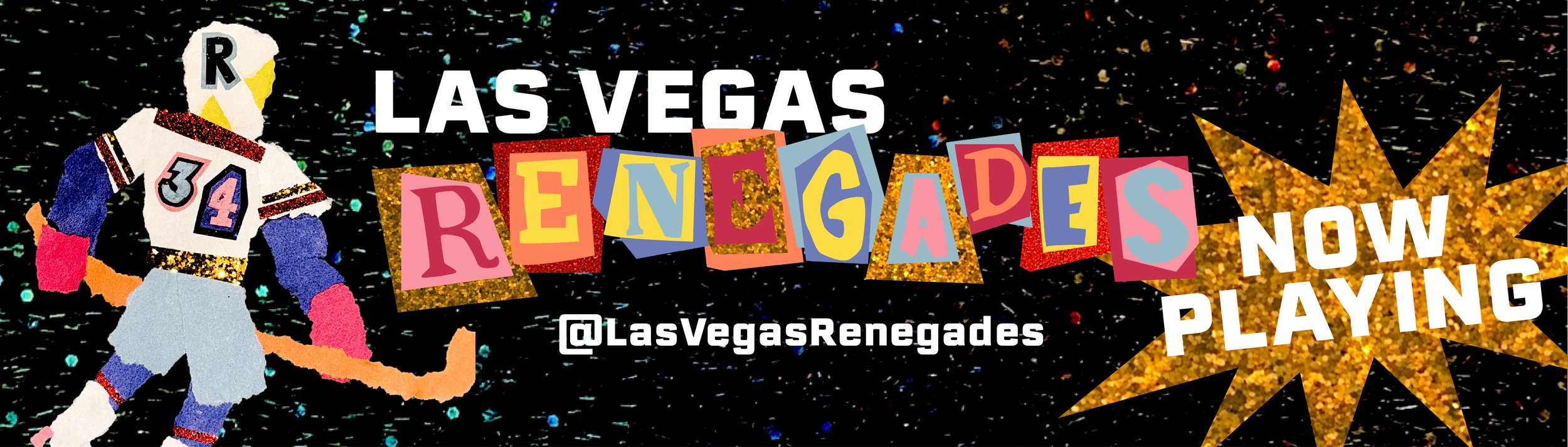
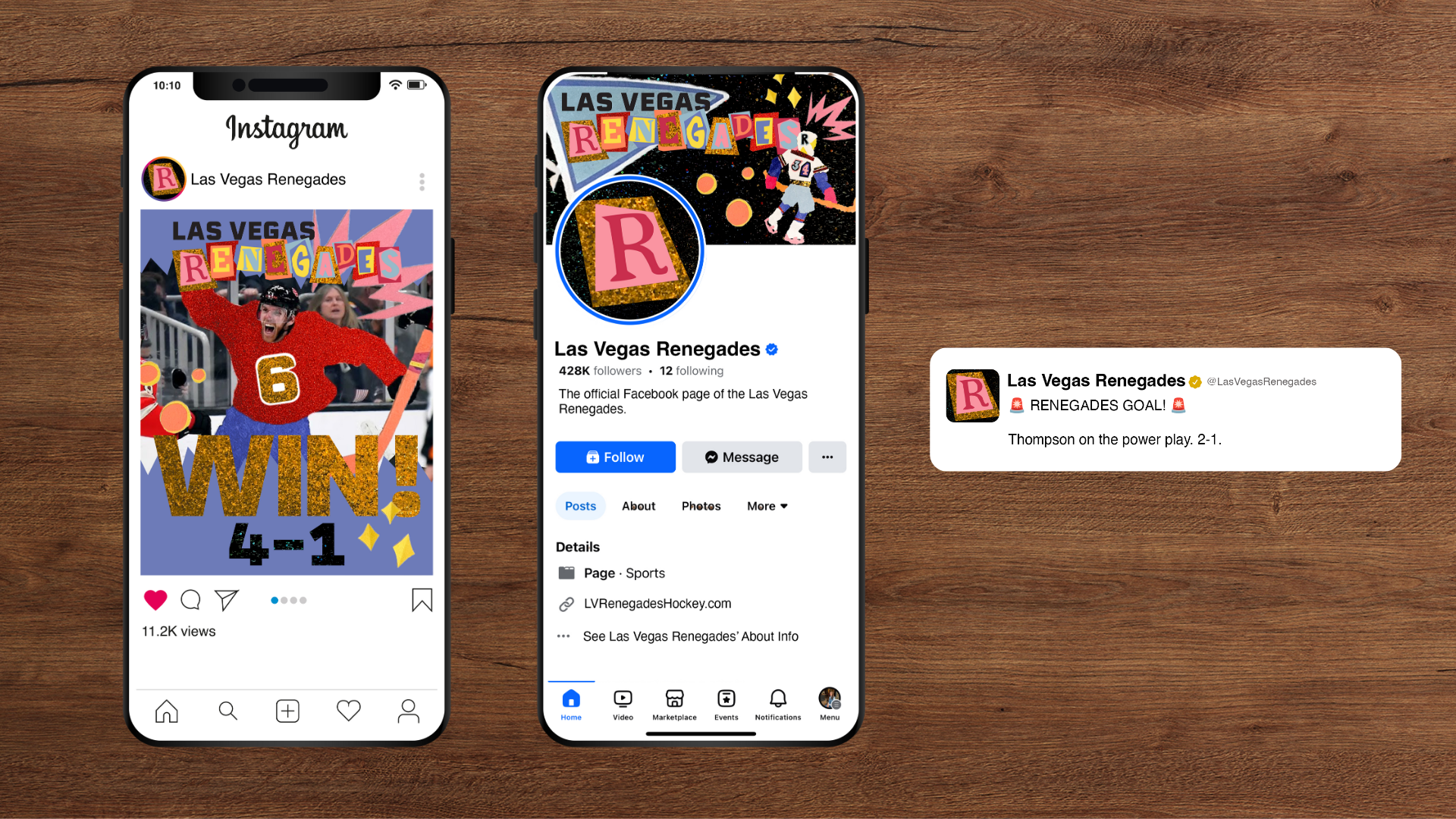
Social Media Mock-up
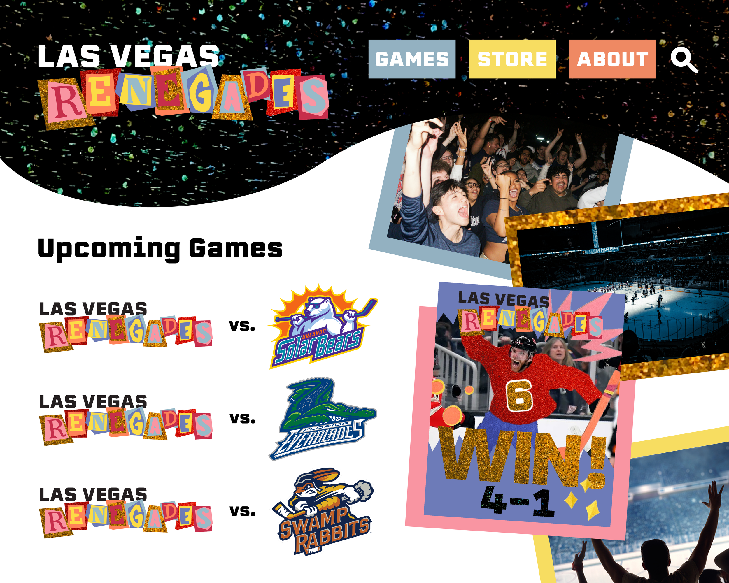
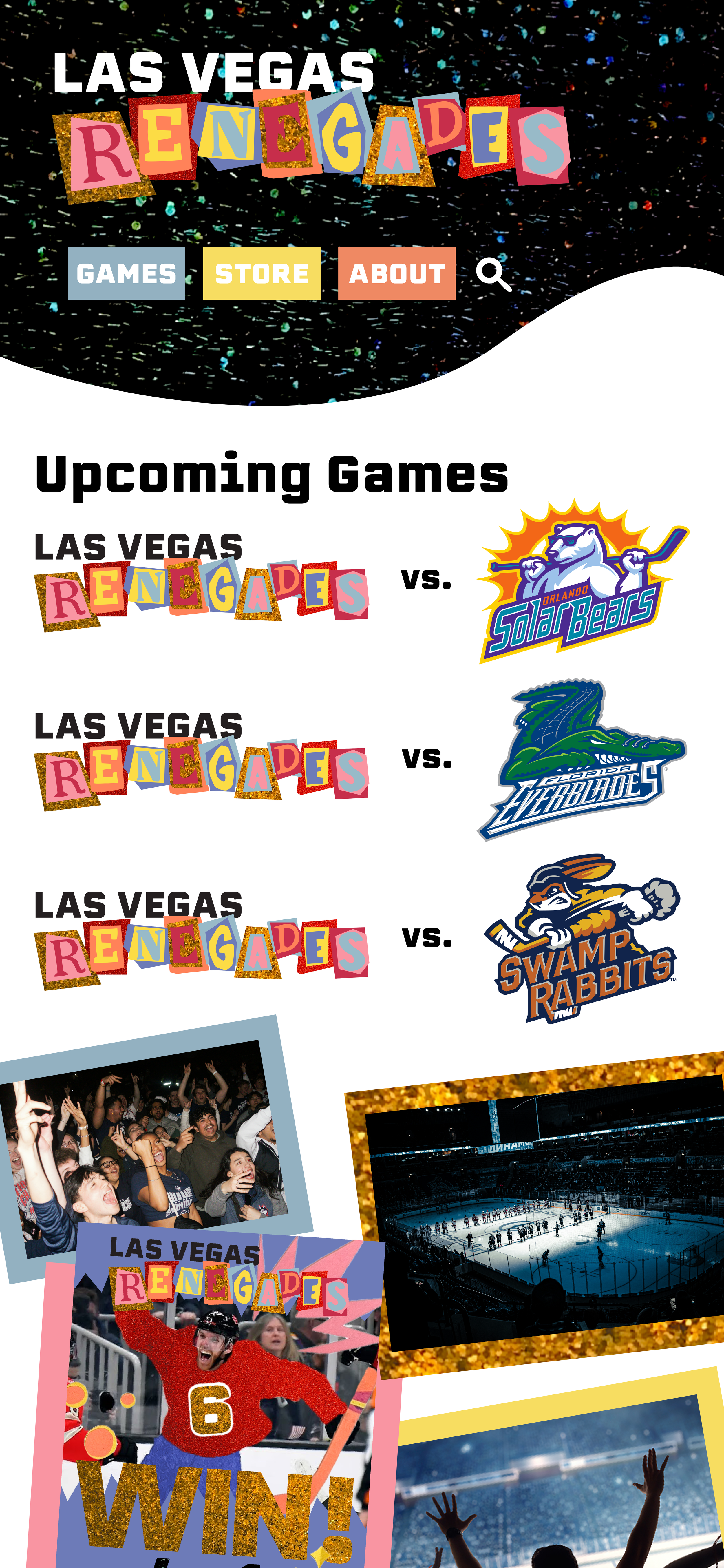
Website Mock-up
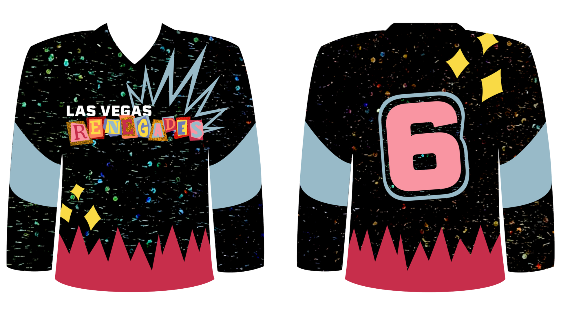
Uniform Design
Brand Video
I do not own the rights to photos or videos used in this video.